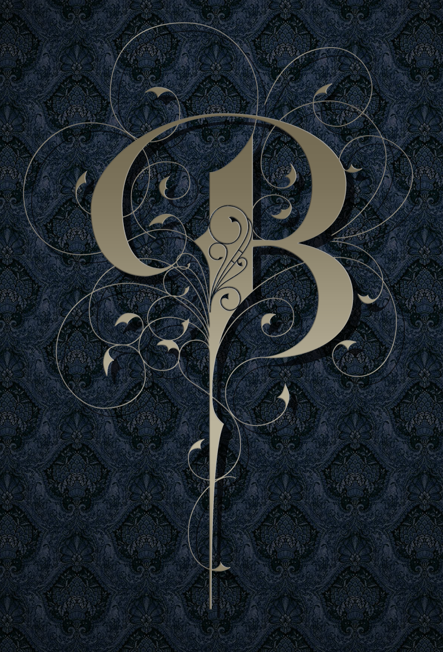
B
For this excercise, I simply wanted to draw a single letter, and decorate the hell out of it.
As I was drawing, I took inspiration from designs from turn of the century wrought iron gates. I feel that there is a relationship between ornamental ironwork and lettering that I don’t often hear about.
In early versions of the letter, I played with the composition of curves and flourishes until I had it somewhere around the way I liked it. However, with all the round forms, it began to feel too dainty and rococo.
I found a way to create a balance between masculine and feminine features by dropping the short tail it had in early versions, and in the final version, turning it into a spikey, weapon-like feature. I also felt the “dragon tails” at the end of the curves gave it a more aggressive edge.
Unsatisfied with the “wasted” room in the main stroke of the B, I digitally drew the curves within the counterspace after I was finished.
