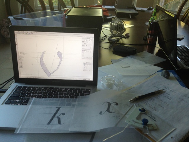

Keyserling: Typeface Design
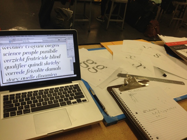
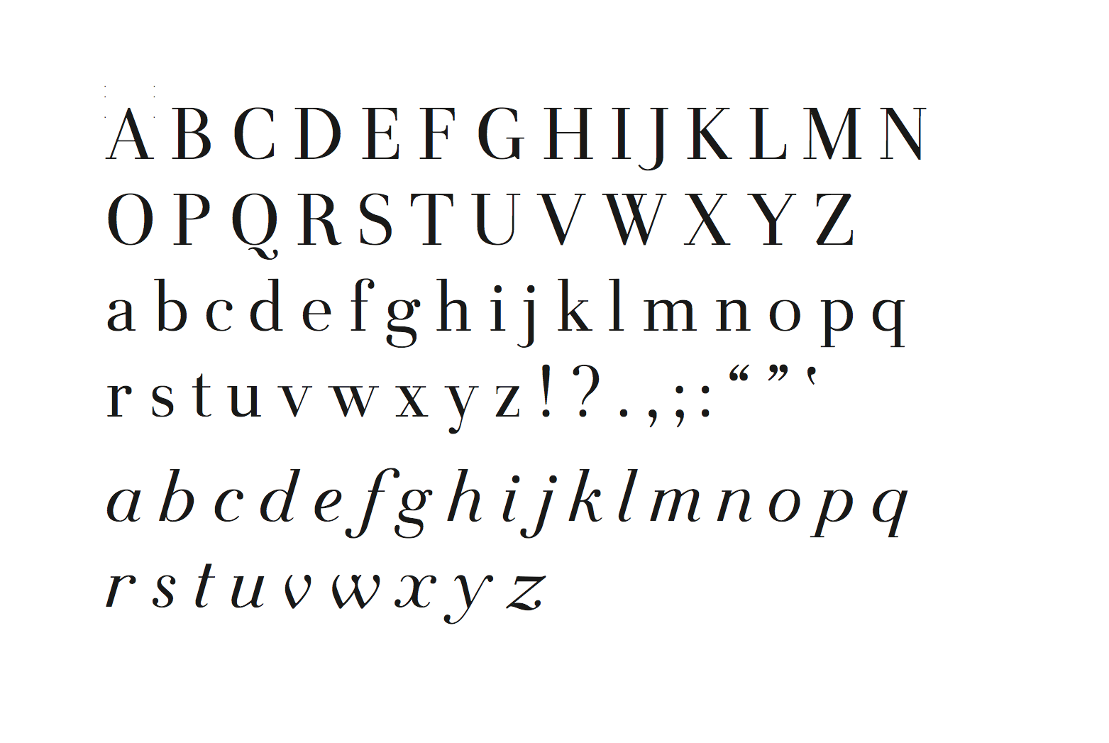
Keyserling (pronounced kai-ser-ling), is a family of fonts heavily influenced by Walbaum and Baskerville. It features a text weight, an italic weight, and a special weight, called Fugue
Story
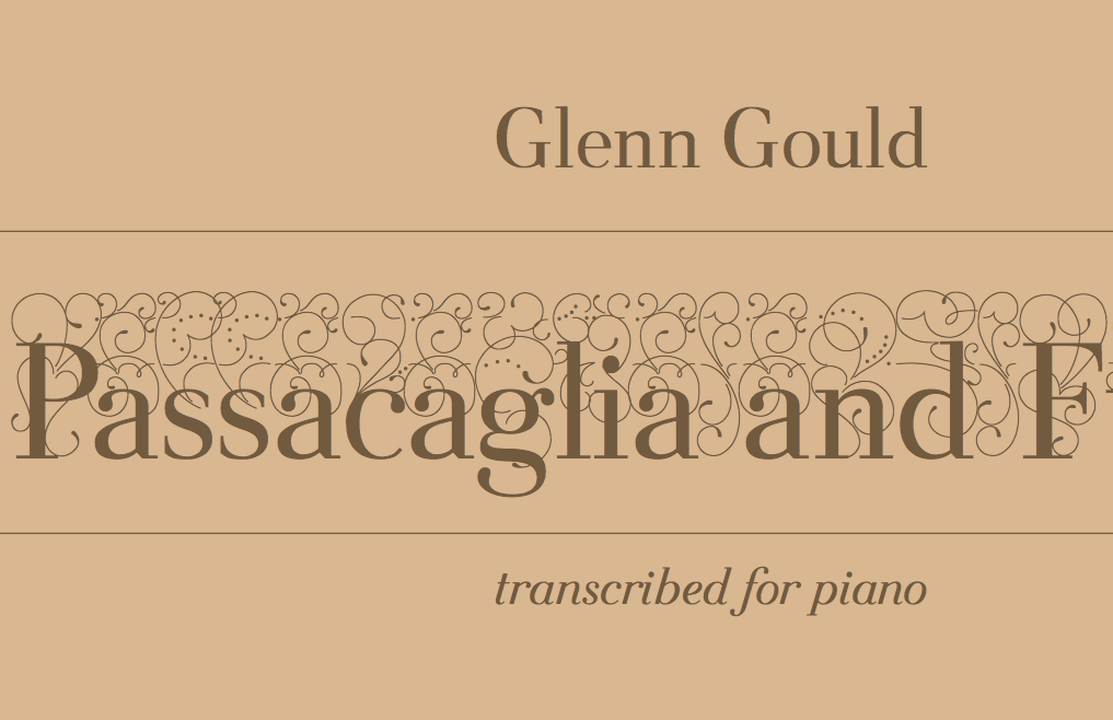
The name Keyserling comes from the story behind Johann Sebastian Bach’s famed Goldberg Variations:
Once upon a time, Count Hermann Carl von Keyserling, Russian Ambassador to the Saxon Electoral Court in 1742, was quite an insomniac. He asked his good friend, Bach, to compose him a set of pieces to listen to during his sleepless nights, and that became the Goldberg Variations.
I believe the contrapuntal harmony present of Bach’s work is very much like type design. You begin with two or three beautiful motifs that are repeated, reused, and varied throughout the work. Both counterpoint and typography require an understanding of systems. Both are beautiful.
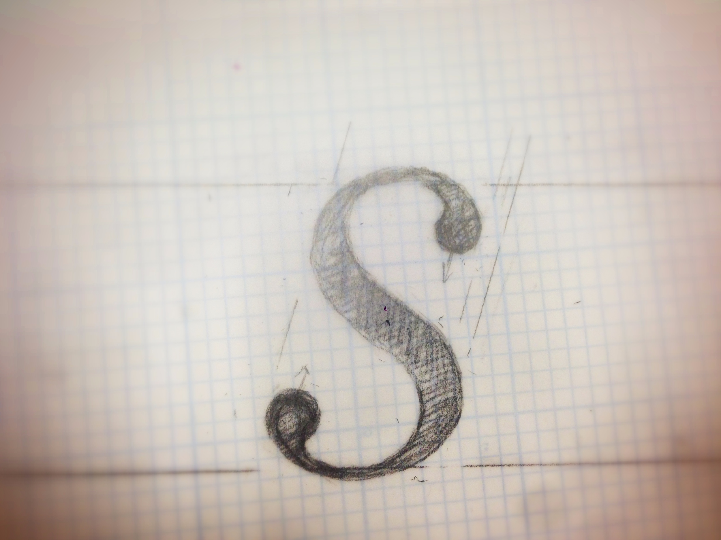
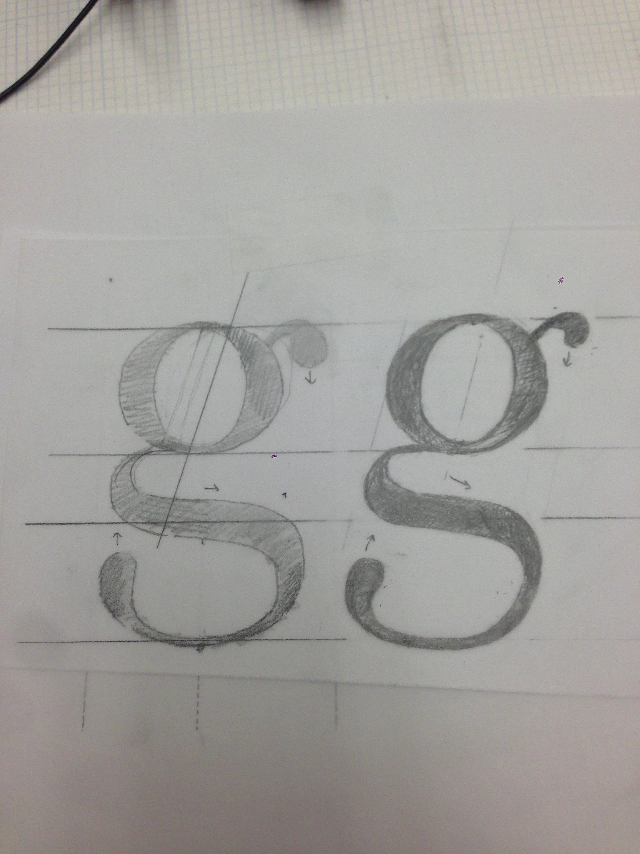
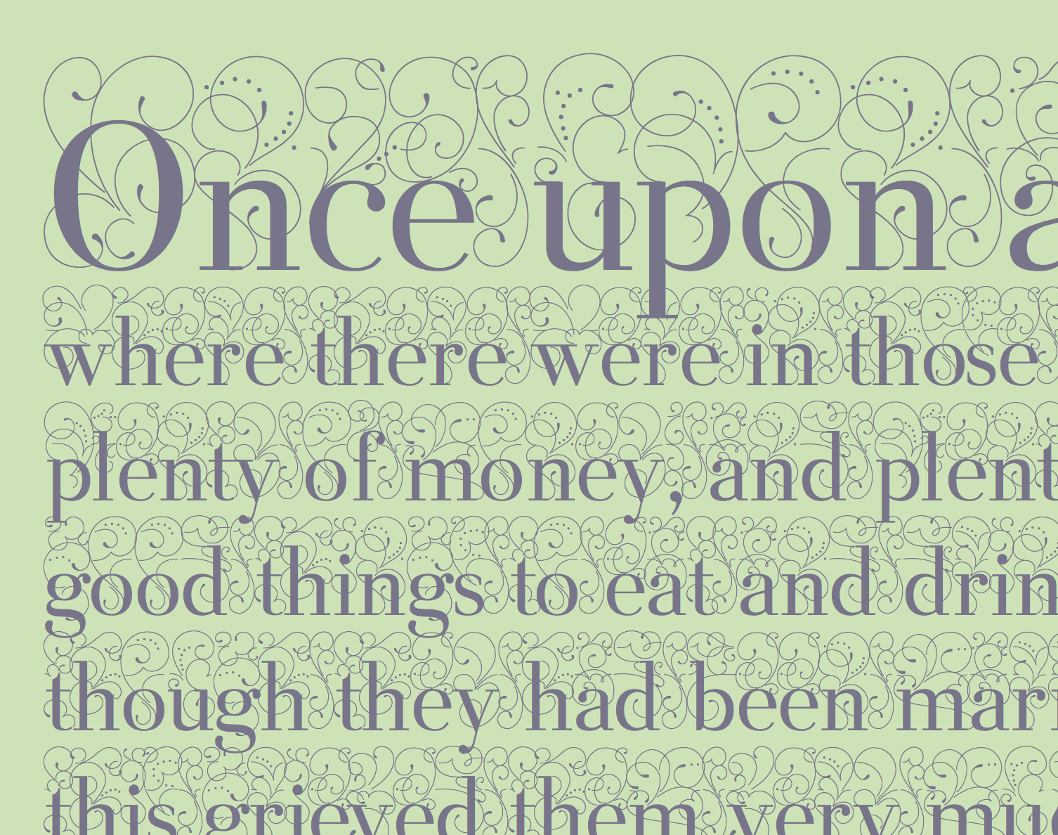
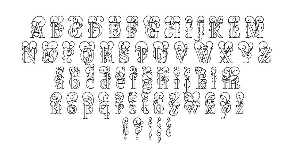
Fugue
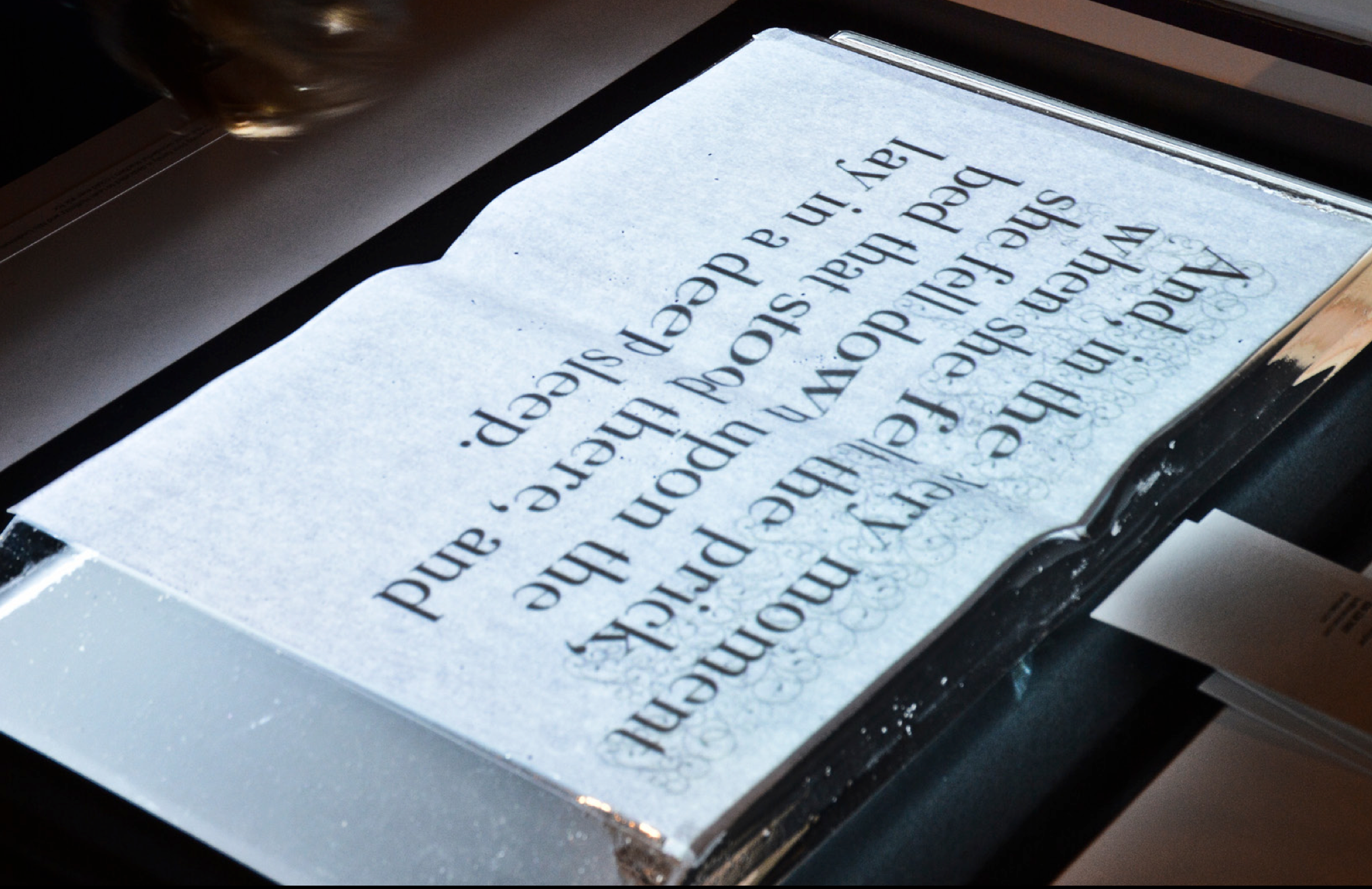
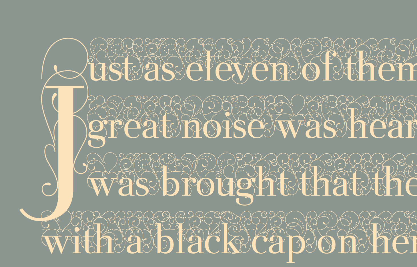
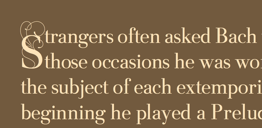
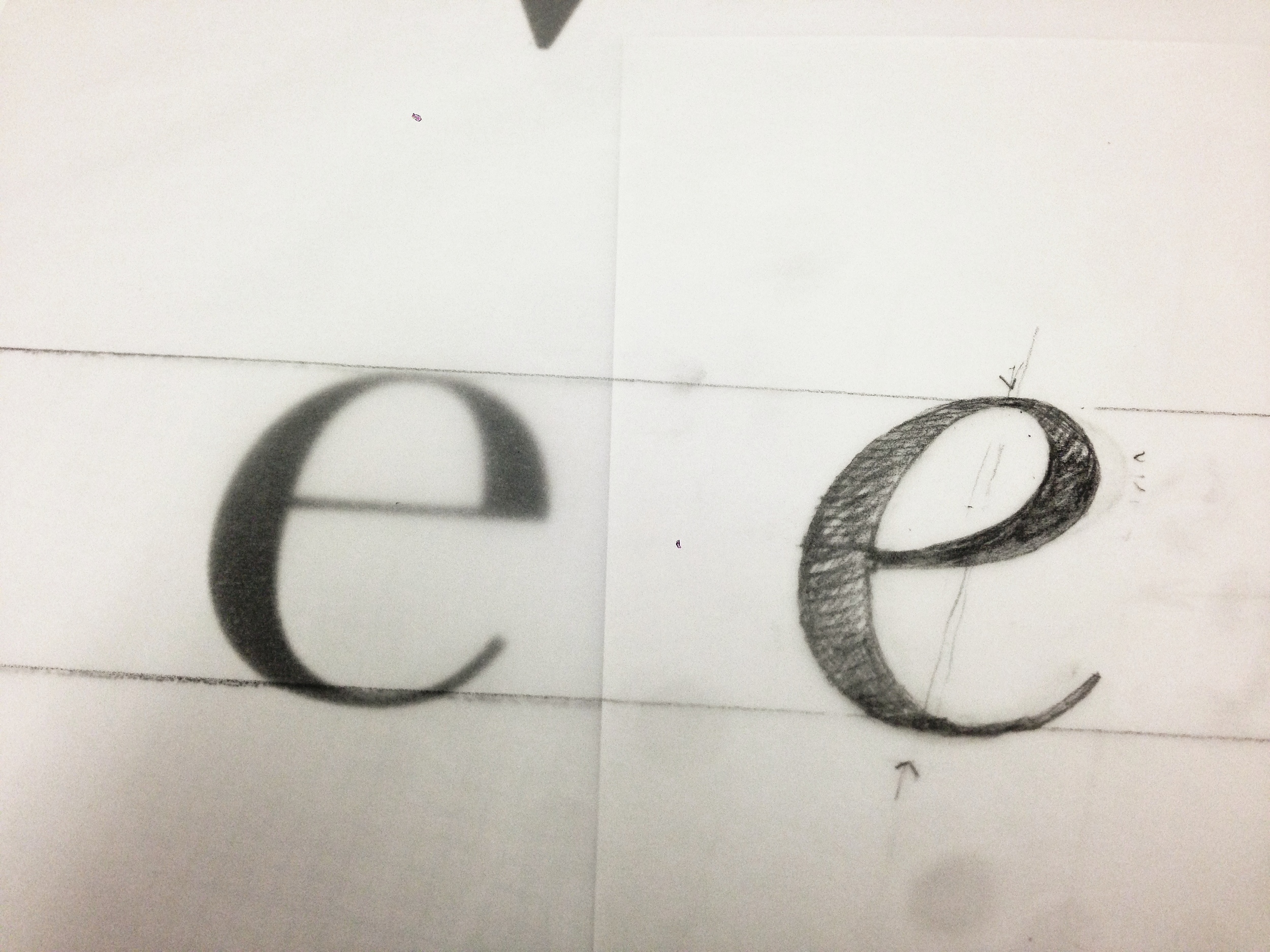
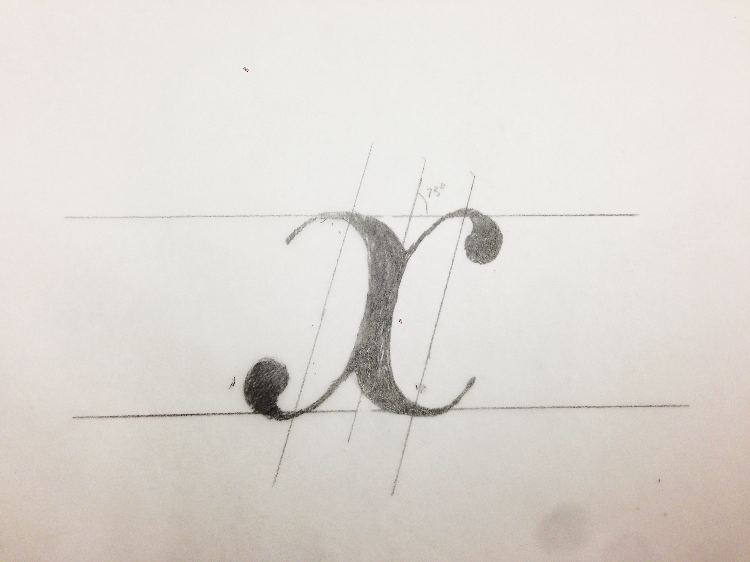
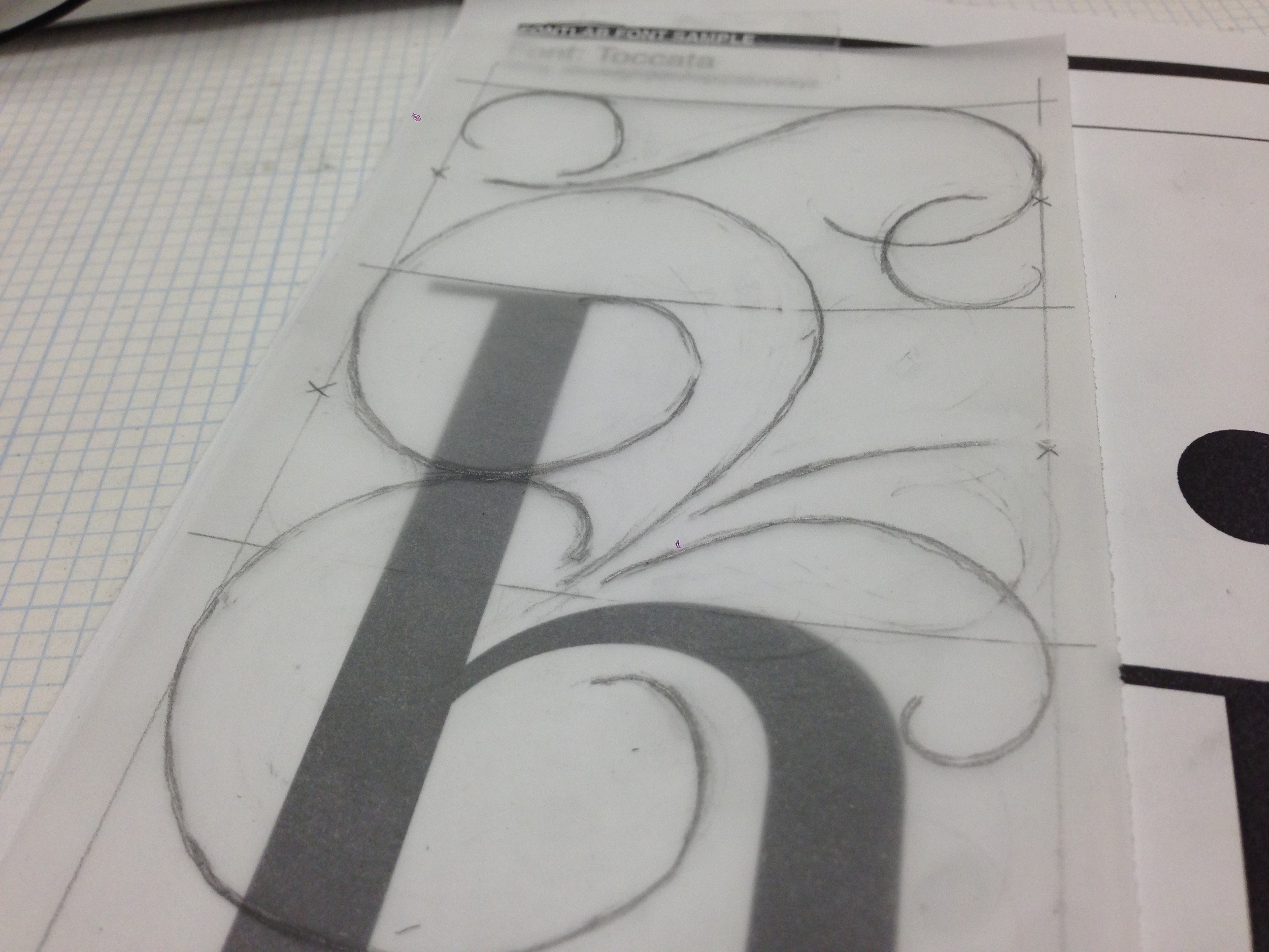
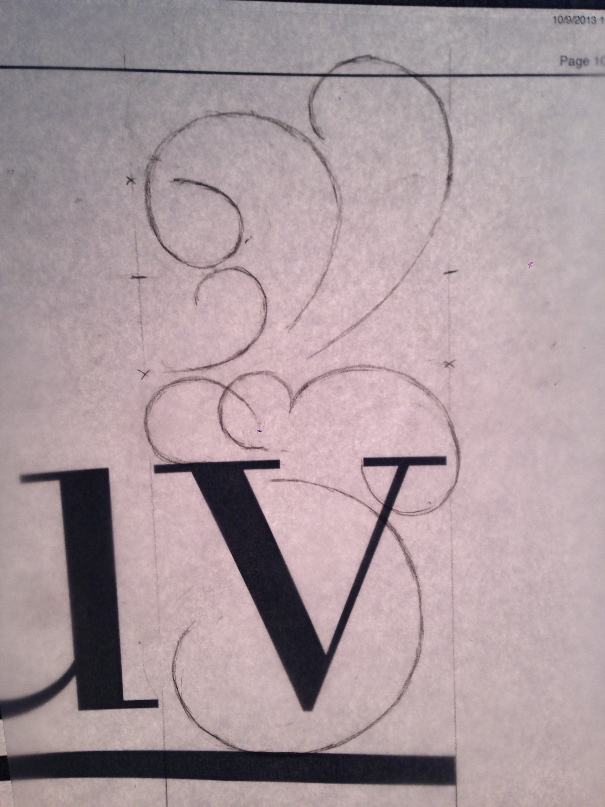
Keyserling Fugue is inspired by the work of 17th Century writing master George Bickham the Elder. What if the beautiful, intricate decorative writing of Bickham could be tamed into a font?
To realize this, I developed a grid system for flourishes so that even though they would see and feel very freeform and expressive, the letters would "lock" into one another as if they were connected.
Voice Activated Font
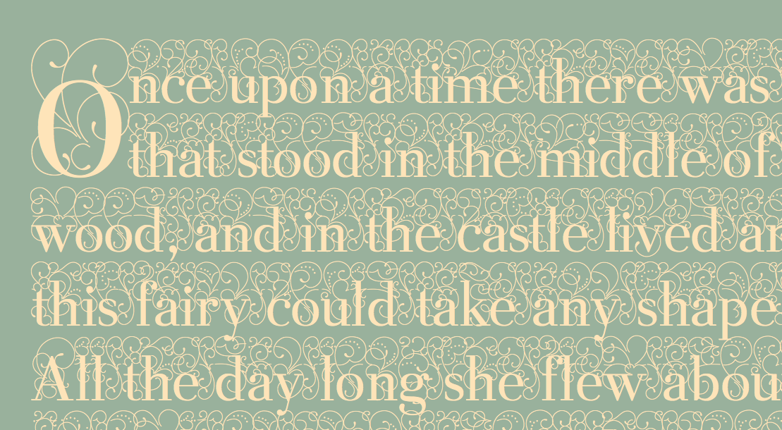
Keyserling Fugue was designed primarily with fairy tales and children’s stories in mind. Glyphs are also made to be individual Adobe After Effects animations, and composited through a coding language called Processing.
The typeface is sound/voice activated. When a participant begins to read, Processing activates and the flourishes begin to animate and grow.
click to play